Table of Contents
This comprehensive guide will help you install, configure, and customize your Conferly Conference & Event Website Template to build a modern, professional, and engaging platform for promoting your events, showcasing speakers, managing schedules, and enabling seamless attendee registration. Whether you’re organizing business conferences, corporate events, seminars, or virtual summits, Conferly provides all the essential tools and flexible design options to create a powerful online presence and deliver an exceptional user experience.
Conferly Pro Theme Documentation
Introduction
This template kit is designed to help you create a modern, professional, and user-friendly website for your conference and event management business. Whether you are organizing corporate conferences, business summits, webinars, workshops, or large-scale events, the Conferly template includes all the essential features to showcase your event details, highlight speakers, present schedules, and enable seamless attendee registration. With its clean design and flexible customization options, Conferly helps you build trust, increase engagement, and promote your events with confidence.
Customizing Your Website
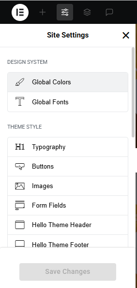
Global Settings
To set global styles:
- Go to Elementor > Site Settings.
- Adjust typography, colors, and layout settings.
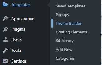
Header & Footer Setup
- Use Elementor Theme Builder to edit the header and footer.
- Customize the navigation menu, logo, and contact details.

You can drag and drop the elementor widget’s menu first. If you’d like, you can add items or simply drag each one, after which you can add a icon list from the widget and apply a custom style from the style option.
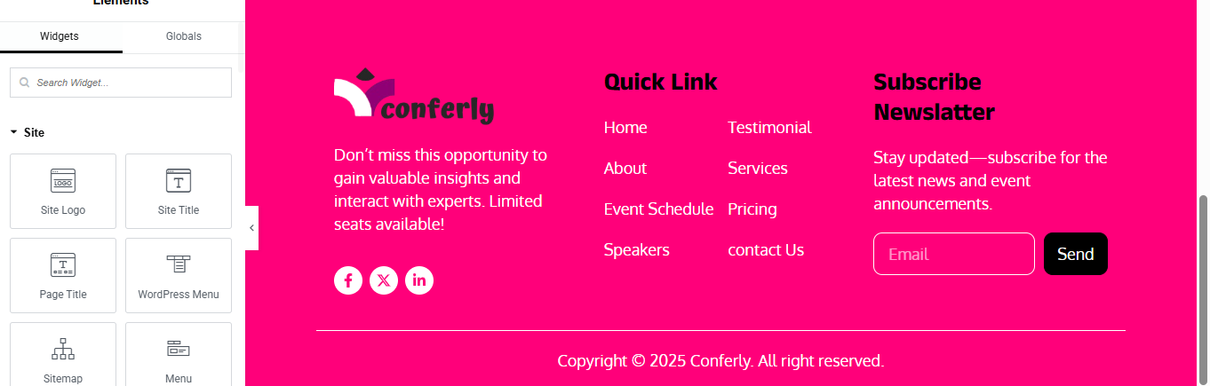
you can add newslatter form, contact details, logo, menu and if you wish in footer, and create you best design.
Home Page Setup
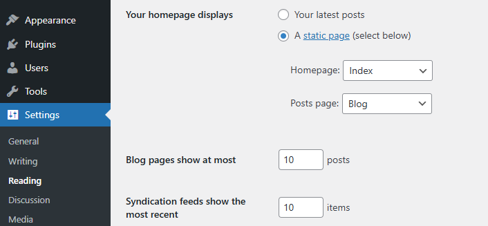
Using Pre-Built Layouts
Navigate to Setting >> Reading
Choose the Static Page option.
Choose an existing homepage or create a new one.
Add The Section in home page using elementor
Add components such as these using the Drag & Drop Builder:
- Hero banner Section
- about section
- Counter Section
- Schedule Of Event Section
- CTA Section
- Gallery Section
- Services Section
- Pricing Section
- Team Section
- Review Section
- Contact Section
Main Hero Section

Click + Add Container
- Select Full Width Container
- In left panel → Layout
- Content Width: Full Width
- Min Height: 600px
- Align Items: Center
- Justify Content: Space Between
- Go to Style → Background
- Choose your background image
- Position: Center Center
- Size: Cover
- Repeat: No Repeat
- Color: #000000
- Opacity: 0.6
Create Left Content Container
- Click + Add Container (Left container)
- Set Width: 55%
- Direction: Column
- Align: Start
- Drag Heading widget
- Drag Text Editor widget for description
- Add Date and Time Section
- Add Icon box widget
- added icon title and description
- Drag Button widget for register widget
Create Right Image Container
- Add Image widget
- Select your speaker image
About Section

Click + Add Container
- Select Full Width Container
Create Left Content Container
- Drag Heading widget for top small heading
- Style → Text Color: theme-color
- Typography:
- Size: 16px
- Weight: 600
- Drag Heading widget for main heading
- Typography:
- Size: 42px
- Weight: 800
- Line Height: 1.2
- Drag Text Editor widget Add Description Text
- Add Highlight Quote Text with Left Border
- Color: #000
- Typography:
- Size: 18px
- Weight: 600
- Drag Button widget Add Register Button
Create Right Image Container
- Select your image add image widget
Create Overlay Card
- Advanced → Positioning:
- Position: Absolute
- Horizontal: Left 0px
- Vertical: Middle
- add iconbox inside overlay card
- added icon, title, description
Create Black Contact Card
- Add another container below pink card
- added phone number and email address inside the black content card
Counter Section
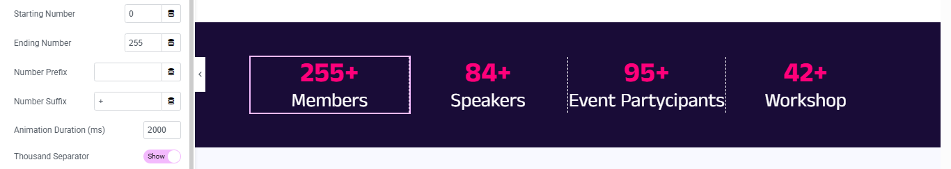
Click + Add Container
- Select Full Width Container
- Style → Background
Create 4 Counter Grid Containers
- Add Counter Widget
- added counter number and title
- Style Counter Number
- Style → Number
- Typography:
- Size: 42px
- Weight: 700
- Style Counter Title
- Typography:
- Size: 18px
- Weight: 500
- Add Border-right of all counter item
- Select first counter container → Advanced → Border
- duplicate for all 4 counter and change title and description
Schedule Of Event Section
Click + Add Section
- Select 1 Column structure
Drag Heading widget for add small heading
- Typography:
- Size: 16px
- Weight: 600
- color:pink
Drag another Heading widget for add main heading
- Style:
- Alignment: Center
- Size: 36px
- Weight: 700
- Color: Black
Drag Tabs Widget
- Create Tab Content Layout
- Now drag Inner Section widget inside tab content.
- Column width:
- Left Column: 30%
- Right Column: 70%
- Add Image (Left Column)
Add Event Details (Right Column)
- Add Location Text, time, and date for event
- then added title, description and author name
- added 2 button of content right side
Style Tabs (Important)
- Click Tabs Widget → Style Tab
- Tabs Style
- Alignment: Center
- Normal Tab: Background: Light Gray, Text Color: Black
- Active Tab: Background: Pink, Text Color: White
- Border
- Border Width: 1px
- Border Color: Pink
- Content Box Styling
- Background: Light Gray (#f5f5f5)
- Padding: 30px
- Border: 1px solid Pink
CTA Section
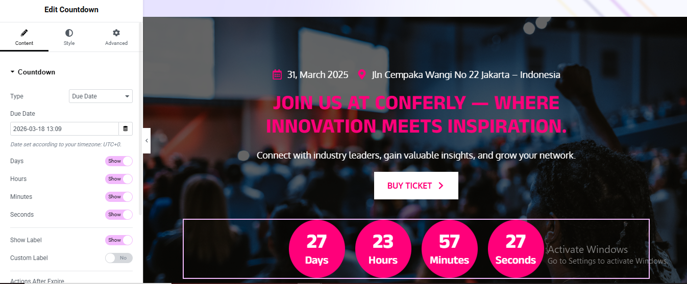
Click Edit with Elementor
- Set Background Image
- Choose your background image
Add Date and Location Row
- add icon list widget for date and location
- choose icon and than added title for it
Drag heading for main title
- Alignment: Center
- Text Color: White
- Typography:
- Size: 48px
- Weight: 700
Drag texteditor for description text
Drag Button widget for buy ticket button
- Background Color: white
- Text Color: pink
- Border Radius: 4px
- Padding: 15px 30px
Drag Countdown widget
- Make Circular Countdown Design
- Go to Style tab → Boxes
- Background Color:#ff007a
- text color: #fff
- Border Radius:50%
- Center Countdown Content → Alignment → Center
Gallery Section
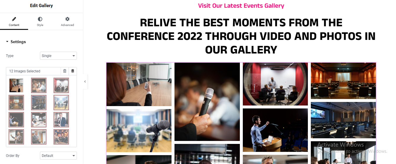
Click + Add New Section
Drag Heading widget for section subtitle
- Alignment: Center
- Text Color: #ff007a
- Font Size: 16px
- Font Weight: 600
Drag another Heading widget for main heading
Drag Gallery widget
- Set Gallery Layout
- Layout:
- Columns: 4
- Image Size: Medium Large
- Spacing: 15
- Enable Masonry Layout
Services Section

Click + Add New Section
- Set Section Background (Dark Purple)
Drag Heading widget for small section heading
- Alignment: Center
- Text Color: #ff007a
- Font Size: 16px
- Font Weight: 600
Drag another Heading widget for main heading
Add Inner Section for Service Cards
- Add First Service Card (Icon Box)
- add icon title, and description
- Style the Card (Important)
- Click Column → Style tab
- Border Type: Solid
- Border Color: #ff007a
- Border Width: 2px
- Border Radius: 20px
repeat for all service card and change the
Pricing Section

Click + Add New Section
- Drag Heading widget for small top heading
- Alignment: Center
- Color: #ff007a
- Size: 16px
- Weight: 600
Drag another Heading widget for main title
- Add Inner Section for Pricing Cards
- Click + Add Inner Section
- Select 3 Columns
Add First Pricing Card
- Drag Image Box widget
- added title and description
- Add Price Text
- Color: #ff007a
- Size: 32px
- Weight: 700
- Alignment: Center
Add Features List
- Drag Button widget
- Background: #ff007a
- Text Color: White
- Border Radius: 5px
- Alignment: Center
Style the Pricing Card
- Border:
- Type: Solid
- Color: #ff007a
- Width: 2px
Duplicate for Other Packages
Team Section

Click + Add Section
- Set Background Color
- Set: Background Color
Left Column – Add Subtitle
- Drag Heading widget
- Style:
- Color: #ff007a
- Size: 40px
- Weight: 700
- Line Height: 1.2
- Drag Text Editor widget add description text
- Style:
- Color: #ffffff
- Size: 16px
- Line Height: 1.6
- Add Button
Right Column – Add Inner Section
- Drag Inner Section widget into Right Column
- Create Speaker Card
- Drag Image widget
- Add Name Box
- Style:
- Alignment: Center
- Color: #ff007a
- Size: 18px
- Weight: 600
- Add Social Icons
- Style Speaker Card Box
- Background:#ffffff
- Border: Type: Solid
- Color: #ff007a
- Width: 2px
Duplicate for More Speakers
Review Section

Click + Add Section
- Add Section Background
- Background → Gradient
Drag Heading widget for small title
Drag another Heading widget for main title
- Add Carousel Widget
- Add Carousel Items
- added description, image, customers name, designation
Carousel Settings
- Style Testimonial Card
- Click Carousel → Style tab
- Create Black Review Box Effect
- duplicate for 3-4 review card
Contact Section

Click + Add Section
- Add Background Image (Dark Effect)
- Click Section → Style tab
LEFT COLUMN – Heading Area
- Add Small Subtitle
- add main title
- added short description
- Add Contact Info Boxes
- Customer Support
- Email Support
- Location
Style Icon Box
- Icon Box → Style
RIGHT COLUMN – Contact Form Box
- Create Contact Form Fields
- Style Form Box
- Click Column → Style
- Style Form Fields